
Characteristics
Characteristics in general
Clarendon (as reworked by Eidenbenz in 1952) is a slab serif typeface with bracketed serifs, and in style it is very closely related to the modern faces (statische / klassizistische Antiqua). Key properties are the same:
-
vertical axis;
-
noticeable thick-thin contrast;
-
only little variety in the widths of the upper case letters;
-
strokes on the baseline and on the x-line (entry strokes, serifs) are horizontal, not oblique or coved;
-
letters like a c e have very small apertures and don’t attempt to connect to the previous or to the next letter in any way.
It doesn’t seem to be wrong to say that Clarendon (Haas) is simply a modern face where all thin elements (hairstrokes, serifs, hooked terminals) have been fattened, reducing contrast a bit. The same can be said for most typefaces called Ionic (Commercial Classics say that Clarendons and Ionics are essentially the same; external link).
Serif design
Serifs are emphasised in every way: For one thing they are bold, their height measuring about 55% of the stem width. In addition to that they are designed as large as possible, almost completely closing the apertures of letters like E, S, u, and increasing the character widths of letters like h, n, u considerably.
Serifs are bracketed in most places. But bracketing isn’t everywhere. Where two strokes meet and none of them is a serif, there is no bracketing (look at B, D, E, F, L, P, R, T). Below there’s a close-up of Clarendon BT:

Fig. 1
It’s interesting to compare the letter E in a few typefaces. Take a look at how much black and white there is, how the shapes are formed, where there is bracketing and where there isn’t:
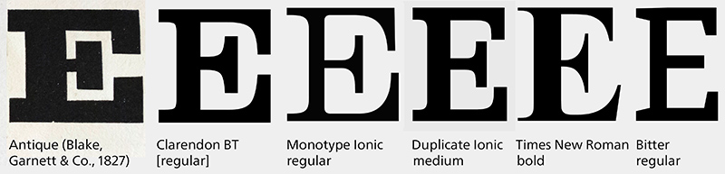
Fig. 2
In some typeface classifications the presence or absence of bracketing is seen as a key feature, as a divide between Egyptienne and Clarendon typefaces. But how important is the bracketing of the serifs really? In some cases it may be important. In other cases it may be neglectable: Take a look at the following typefaces – they are so similar in terms of form, style, and terminals that it doesn’t seem helpful to put them into different classification drawers just because the left typeface lacks bracketing.

Fig. 3
Be it as it may – at any rate Clarendon (Haas) has bracketed serifs, and this may add a bit to its overall friendliness.
Weight
Compared to other typefaces Clarendon is quite bold. Remember that Eidenbenz intended to design a sturdy display typeface, in just one weight. Most digitisations added even some more weight.
Terminals
Several letters feature ball terminals, or large and sturdy hooked terminals, or both. These terminals are a prominent feature of Clarendon (Haas).
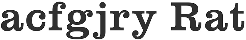
Fig. 4
The large and sturdy hooked terminals are a feature that can be seen in many of the original Egyptienne typefaces. Here’s an example:
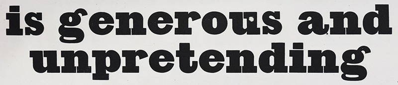
Fig. 5
Large, but delicate hooked terminals can be seen in quite a few fat faces. They may only be loosely connected to Clarendon (Haas), but they look so nice that they deserve being shown all the same. There’s a flow to them that makes them a very fine feature of these fat faces:
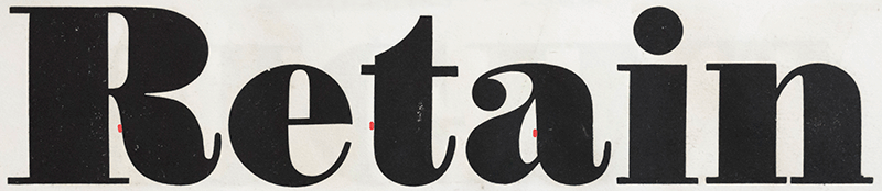
Fig. 6
Italic fat faces may, in addition, have entry strokes that are designed in a very similar way:

Fig. 7
A side glance at Duplicate Ionic
I consider Duplicate Ionic to be a contemporary relative of Clarendon.
Duplicate Ionic was designed by Christian Schwartz and Miguel Reyes and issued by Commercial Type. It draws on various sources (external link), the early Clarendon typefaces being one of them. It seems natural, therefore, that it bears resemblance to Clarendon (Haas) and Clarendon BT. Here’s a comparison between Duplicate Ionic (top) and Clarendon BT (bottom):
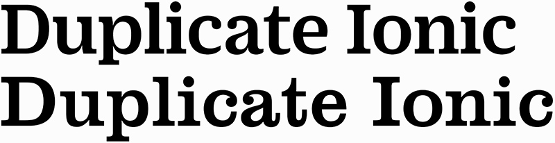
Fig. 8
Duplicate Ionic lacks the hooked terminals and the emphasised ball terminals, and has shorter serifs. And there’s even some dynamic humanist influence in the letters c and e that are open and don’t have horizontal stroke endings. You could say Duplicate Ionic is a cousin of Clarendon (Haas) that has, if you focus on isolated letters, lost some nice features, but is an improvement when it comes to reading whole words and large amounts of text.
By the way: Duplicate Ionic comes with a true cursive that is even more dynamic.

Fig. 9
Image credits / information
Fig. 1 – ‘E x’: Clarendon BT.
Fig. 2 – Antique taken from Blake, Garnett & Co., Specimen of Printing Types, 1827 (London, St. Bride Library); the other letters are set in the respective digital fonts, scaled to the same size.
Fig. 3 – ‘Mittwoch’, left: Neue Egyptienne, Corps 28, in: Bauersche Giesserei, specimen book ‘Hauptprobe’, c. 1917, p. 115 (St. Gallen, Zentrum für das Buch). Right: Clarendon BT.
Fig. 4 – ‘acfgjry Rat’: Clarendon BT.
Fig. 5 – Canon Antique, No. 2, in: Blake & Stephenson, Specimen of Printing Types, probably 1839 (London, St. Bride Library).
Fig. 6 – Ten lines Pica No. 1, in: Blake, Garnett, & Co., Specimen of Printing Types, 1827 (London, St. Bride Library).
Fig. 7 – An italic fat face (no name given), in: Blake, Garnett & Co., A Specimen of Printing Types, &c., probably 1819 (London, St. Bride Library).
Fig. 8 – Top: Duplicate Ionic Medium from a specimen (PDF) on commercialtype.com; bottom: Clarendon BT [regular].
Fig. 9 – Duplicate Ionic Medium and Italic Medium from a specimen (PDF) on commercialtype.com.
[021]