
Most roundels look like they ought to, that is: like the ones shown in the Design standards.
Irregular roundels are the ones that look different. They may look better, or worse, or just different than the standard roundels.
You may find it fun to spot these irregular roundels (or you may run away from such geekery).
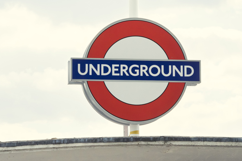
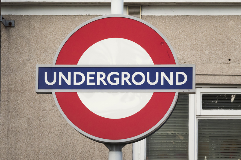
‘UNDERGROUND’ roundels outside stations
Standard versions
Regular roundels outside Underground stations look like any of these three versions, depending on when they were put in place:

The roundels shown below look different.
Leytonstone station
This roundel is based on the 2003 silhouette roundel, but obviously it differs from the standard silhouette roundel: It is ‘part silhouette’ with white counters, moreover there are black lines on either side of the circle. I imagine it would have been far easier to produce a standard silhouette roundel, and it would be interesting to know why someone took it upon themselves to produce this singular roundel. Which is quite gorgeous, by the way.
Wanstead station
This roundel is similar to the one at Leytonstone station, but without the black lines on either side of the circle.
Euston station

As far as proportions go, this roundel is very close to the 2003 silhouette roundel. But the bar doesn’t have the same height throughout. It is higher outside the circle than inside the circle. This is a strange and extremely rare irregularity. (Note that several white roundels can be seen outside the station at the moment, and not all of them have the same proportions.)
Gloucester Road station

For some heritage effect, the original content (UNDERGROUND with ‘ribbons’ and large letters U D) was squeezed into the bar of the 2003 silhouette roundel.
Hendon Central station

This roundel is similar to the one at Gloucester Road station, but the bar isn’t as wide.
Station name roundels
Standard
Regular station name roundels look like this:

Now let’s look at a few different roundels.
Euston station, Northern line (Charing Cross branch)

There are about ten of these roundels on the two Charing Cross branch platforms. Proportions adhere to the standards. But the text is far too large (violating the boundaries of the box defined in the Signs manual), and it’s too light in weight. But the whole thing looks brilliant.

Holborn station (all platforms)
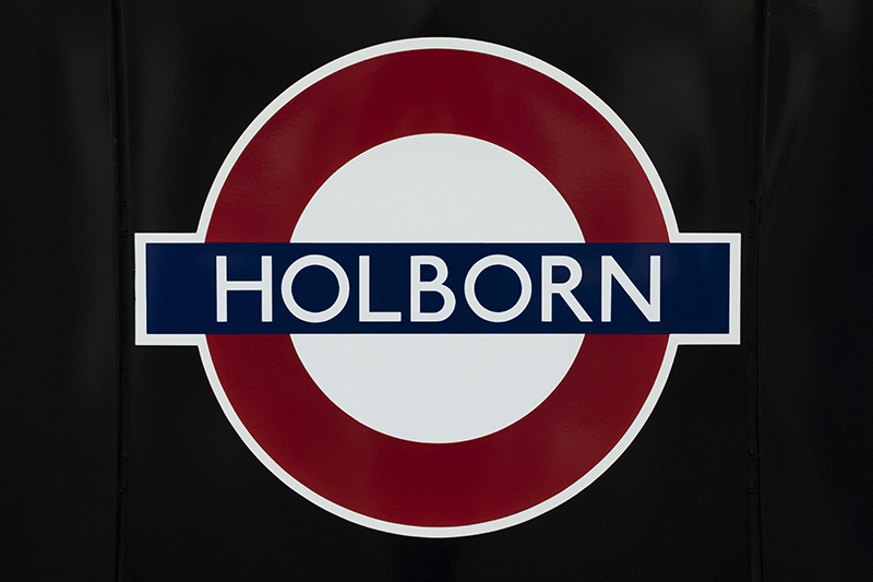
The text is too large and too light in weight, and there’s no white protection area except for a white outline around the whole roundel. Still everything looks just fine.

Pimlico station (both platforms)

When the Victoria line stations were built, most platforms were fitted with illuminated roundels of the ‘EUSTON SQUARE’ type. This is one of them. There’s nothing irregular about it.
Some of these roundels have been replaced. The replacement roundels are roundels of today’s proportions, with a small irregularity: The text is a hint too large, again exceeding the box (which is shown here in light blue):

[015]
Kommentar schreiben