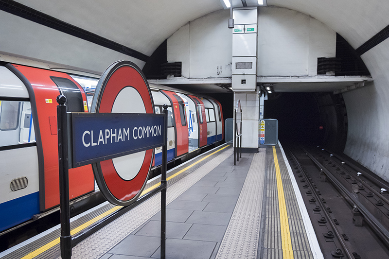
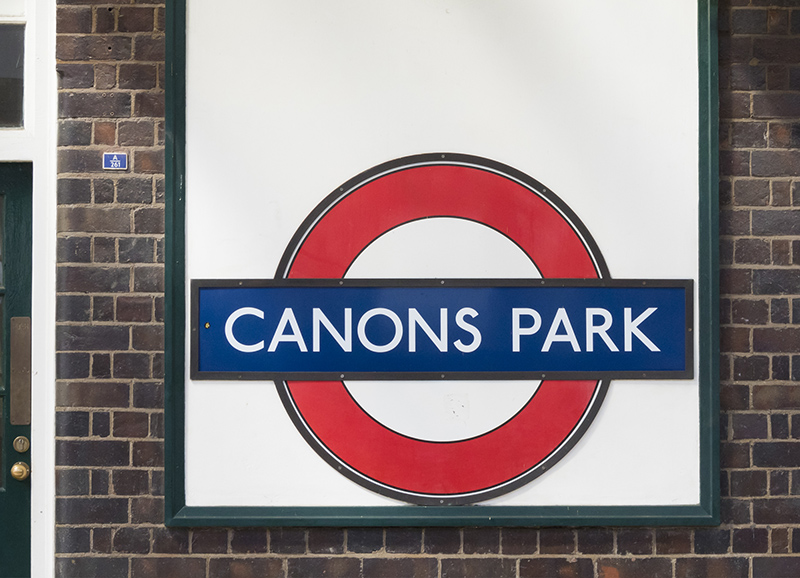
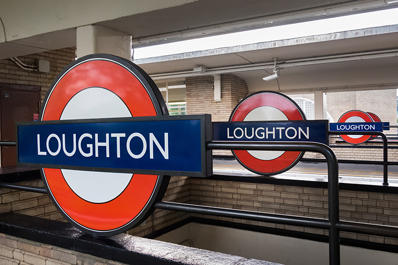
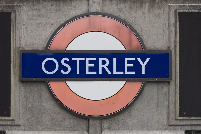
These are some favourites. For more on the ‘PERIVALE’ type of station name roundel go here.


Higher bar; text set on two lines.


Good solution to accommodate the whole station name, using just the space of one line.

Can there ever, ever be too many roundels?

This specific roundel may have been replaced (the picture was taken in 2014).
[002]

Kommentar schreiben