
Roundels 1984–today
We’ll be looking at some developments within the highlighted section of the timeline diagram.
Only roundels are mentioned below. Other symbols, marks, logotypes are not mentioned.
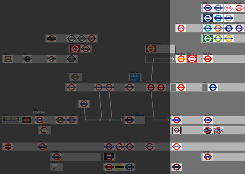
LT and TfL roundels from 1984 until today
Today TfL has a blue roundel with the proportions that are common today. It’s shown below on the right hand side. It has been around for more than fifteen years.
The blue TfL roundel is a successor to the red 1971 roundel. But take care: Today’s roundel didn’t replace the red 1971 roundel seamlessly. For two decades the development was a bit bumpy. There were times with, and times without a roundel representing that corporate level. And for some time there was a red roundel of modern proportions:
![]()
Short explanations:
1984: London Regional Transport (LRT) came into existence. ‘London Transport’ was used as a collective trade name (for joint activities of more than one ‘transport mode’). But there was no roundel representing LRT or London Transport (which corresponds to the blank space in the above figure).
1987: About three years later LRT started using a roundel in connection with the trade name ‘London Transport’ and anything that was not specific to one transport operation. Proportions may have been those of the 1977 roundel (Demuth) or of the 1985 ‘UNDERGROUND’ roundel. The colour was red.
2000: London Regional Transport ceased to exist. Transport for London came into existence and used a logotype for a few years, but no roundel. Therefore, there may have been no roundel at this level from 2000 until 2003.
2003: Transport for London started using the blue roundel. It has been in use since then. Proportions are identical to those of the ‘UNDERGROUND’ roundel (and, in fact, identical to all other ‘mode’ roundel in use since about 2000, except for a few framed varieties).
London Underground and its roundels, 1984 until today
The 1985 ‘UNDERGROUND’ roundel
Remember that since 1971 there had been no special ‘UNDERGROUND’ roundel. The red 1971 roundel without text was used for all purposes. It is only from 1985 that an ‘UNDERGROUND’ roundel was used again.
1985: London Underground Limited came into existence, and received a roundel again. The roundel was designed by Henrion, Ludlow & Schmidt; its proportions were very close to the 1971 roundel (DRU) and to the 1977 roundel (Demuth), but they weren’t identical.
The 1985 ‘UNDERGROUND’ roundel has been in use ever since. (I assume that its proportions were not tweaked after 2000, at the beginning of the TfL period, but I’m not sure).
It looks like this:

Roundel as shown in the London Underground Basic elements standard, issue 2, January 2009, page 4. Note that the roundel is also shown in the LU Signs manual (issue 4, October 2002, page 6). The two roundels are identical as far as proportions go, but in the newer roundel (Basic elements standard) the text is set a bit more loosely, which is for the better.
In all acceptable versions (including the 1 colour, black, and reversed roundels) the text ‘UNDERGROUND’ has to be displayed on the bar. Only in very small sizes may the text be omitted; the roundel is then called a ‘plain roundel’.
At Brixton station this 1985 ‘UNDERGROUND’ roundel can be seen in a very large size. It was put in place in 2004:
‘UNDERGROUND’ roundels outside stations
The 1985 ‘UNDERGROUND’ roundel was used (and still is used) outside stations, either as a panel version or as a silhouette:

Pictures taken around 2015 at Charing Cross, Hounslow East and South Kensington stations.
The roundel on the left is the 1985 ‘UNDERGROUND’ roundel designed by Henrion, Ludlow & Schmidt. It was used outside stations, be it on a small square white panel, on a white cube, or on a totem.
The two other roundels are silhouette versions of the 1985 ‘UNDERGROUND’ roundel:
- The first version of the silhouette roundel was used from around 2000 (see a picture of Southwark station taken in 1999, LTM 2002/4326). It was designed by Hodgson Associates.
- The second version of the silhouette roundel seems to have been designed only a few years later, that is in 2003. It was designed by Wicek Sosna Architects Ltd. It appears that the more massive 2000 silhouette roundel hasn’t been used since.
According to Design standards the 1985 ‘UNDERGROUND’ roundel is still fully valid. But it’s not used much any more. Most roundels installed today are of the 2003 silhouette type.
Underground station name roundels
The 1985 ‘UNDERGROUND’ roundel by Henrion, Ludlow & Schmidt was used as a basis to produce new station name roundels that had the same proportions. All three versions shown below are based on the 1985 ‘UNDERGROUND’ roundel.

Short explanations:
Maybe the ‘FINSBURY PARK’ type (a part silhouette roundel, with white counters) was used first, from 1985, followed by the ‘KING’S CROSS ST. PANCRAS’ type.
The ‘LIVERPOOL STREET’ type (a full silhouette roundel) probably appeared much later, over a decade later, around 2000.
When new roundels are installed today, most often the ‘LIVERPOOL STREET’ type is chosen. If there is no wall (e.g. on open platforms above ground) the panel version is used. The ‘FINSBURY PARK’ isn’t used any more, but quite a few old roundels of that type remain in place.
Use the links to get some more information.
Underground icons
For communication through TfL’s website and digital services many icons were created. Among these icons are several icons representing the ‘Underground’ transport mode. Due to their small size there’s no text on the bar (therefore they are ‘plain roundels’):
![]()
Icons as shown in: Transport for London, Brand iconography standard, February 2014.
Roundels representing Underground lines (for social media)
Traditionally each Underground line is represented by a colour.
Some time after 2010, something new came up for use on social media: Roundels were created to represent every Underground line.
The roundels look the same, they all are plain white reversed roundels without text. It’s their backgrounds that link to the respective Underground lines.

Is it a new idea to have roundels represent the Underground lines? Yes and no: About in the 1970s similar roundels were used on platform friezes (see here), but probably not systematically, not for every Underground line. Therefore it is a novelty to have such a roundel for every Underground line, but the idea as such is not a new one.
Closure of most of the Twitter accounts in 2020 meant that these roundels disappeared, or so I think.
Other roundels
General view
Today there’s a wide range of roundels for all kinds of ‘transport modes’. In 2018 this range looked about like that:
![]()
Note that roundels come and go. The newest additions are the ‘AIR LINE’, ‘CYCLES’ and ‘ELIZABETH LINE’ roundels. On the other hand, the ‘STREETS’ roundel is probably not used any more.
If you want to, you can look for
- the very few roundels that have no blue bar;
- the roundels that use just one or just two colours;
- the roundel with electronically condensed letters on the bar.
The ‘ELIZABETH LINE’ roundel is the latest addition. There has been some tweaking of the main colour; three different documents of 2015, 2016 and 2017 show three different colours:

Buses roundels from 1984 until today
Three main roundels

In 1985 London Buses Limited was formed. A range of roundel drafts in various colours was produced; in the end the roundel shown above was chosen, based on a drawing by Wolff Olins, but with a thinner line around the bar than proposed by Wolff Olins. Proportions are probably those of the 1977 roundel (Demuth). The roundel was probably used from 1987.
In 1994 a management structure named ‘London Transport Buses’ was formed. It used a reversed roundel without text, white on a red background.
From 2000 London Buses, a subsidiary of Transport for London, uses the red roundel with the text ‘BUSES’ in the bar.
Use of the 1987 roundel on buses
The 1987 roundel was applied in a special way to buses: There was generous white outlining to the circle, but not to the bar. The counters were white.

Three reversed roundels in the LRT years
The reversed buses roundel from 1994 is interesting because in the late years of LRT there were two more reversed roundels, one representing the river services, one representing tramlink. Looking back one gets the impression that these roundels formed a coherent group, but they probably didn’t (or if they did it was for a very short time only).

Flexible use of today’s Buses roundel
Today, representation of all things concerning buses is most flexible:
- There is, of course, the normal ‘BUSES’ roundel shown above (red, with text on the bar).
- When applied to buses, it turns into a reversed roundel (white, with red text on the bar).
- At bus stops a red roundel without text on the bar is used, as shown below. (Note that at today’s bus stops you will still, and quite often, see yet another roundel that is probably a few years older; it is red, with the white text ‘BUS STOP’ on the bar instead of below the roundel).
- Icons for electronic displays are the red roundel, the reversed roundel, or the bus pictogram. There is no text because of the small size.

Therefore, all in all, we find at least six symbols that are frequently used to represent the ‘buses’ transport mode.
DLR roundels
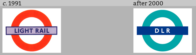
There have been various symbols and logos representing Docklands Light Railway. Two of them were roundels.
The first roundel (above, left) was used from the early 1990s until 1994 (when the Beckton extension was opened). It was designed by Wolff Olins. (Zone7 shows a leaflet on Flickr, here / here; and Brian Creasey shows a picture of a DLR train with that roundel).
The second roundel (above, right) came into use in TfL times, at some time after 2000. There are very few letters on the bar of this roundel, therefore it seemed appropriate to add some space between them (as shown above). About a decade later this was changed; today the letters are set a bit more tightly.
Outlook
From the lively past of the roundel it can be gathered that there will certainly be some kind of development in the future ...
[014]