
Early roundels (1917–1933)
We’ll be looking at some developments within the highlighted section of the timeline diagram:
Johnston’s drawing

Edward Johnston probably finished his drawing in early 1917. The above figure is taken from Justin Howes, Johnston’s Underground type (p. 60). In all likelihood it shows a print from the holdings of the Crafts Study Centre (No. C.86.128.i).
Colours, lines, text
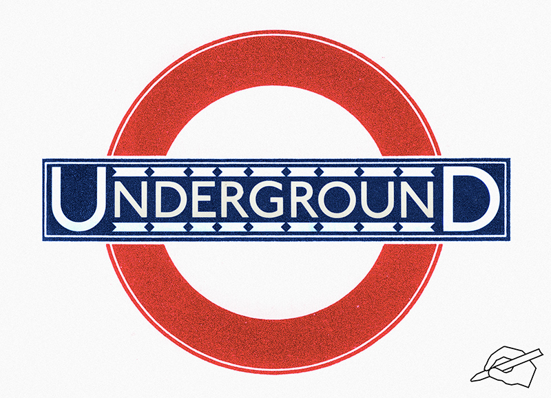
Regrettably the print shown above is only black and white. It is not known what intentions Johnston had with regard to colours. I assume he would have opted for dark lines around a dark bar (either black or blue), and for a red line (not a black one) around a red circle. This assumption is based on a few early line diagrams which show this design, and on three coloured prints from the 1930s in the production of which Johnston was involved.
The letters are Johnston’s letters dating from 1916, except that in the print shown above they are considerably heavier. Most examples of early roundels show letters of the ‘normal’ weight, though.
Therefore, a coloured version of Johnston’s drawing as it was often used could look about like that:
Were there any black lines?
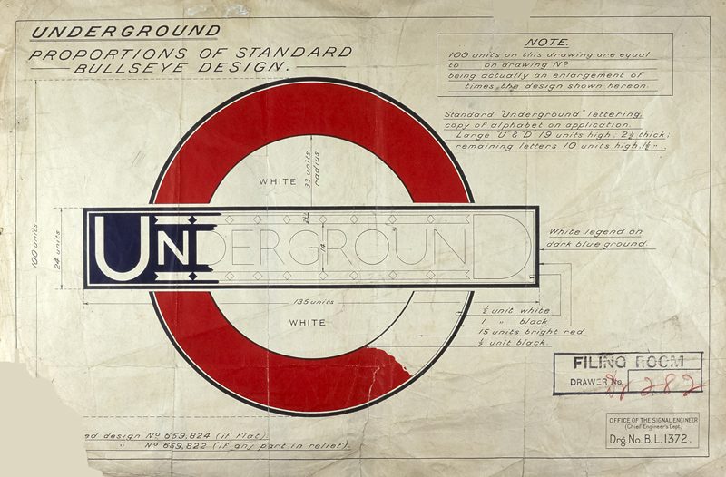
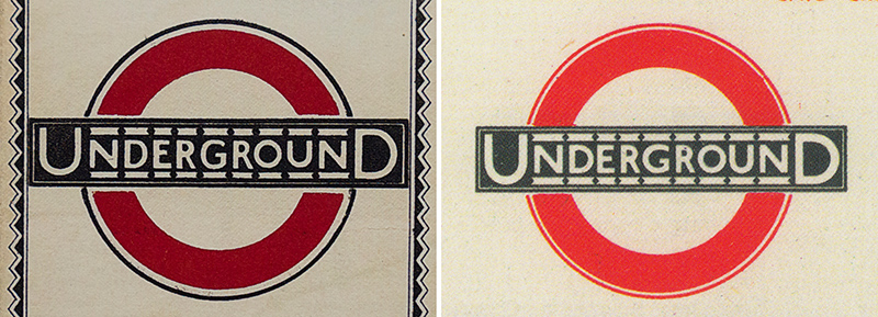
Image credits: London Transport Museum, LTM 2002/399 (Mark Ovenden, London Underground by Design, p. 127).
The above figure shows a drawing that was created in an Underground Engineers’ department in the 1920s. There are several black lines of varying thickness to the circle. It is worth noting that none of the Johnston material shows this kind of black outlining. Possibly he wasn’t even involved in the creation of this drawing. Nevertheless this design became very popular and is common and familiar to this day: Station name roundels with these black lines can be seen at more than fifty stations (see ‘PERIVALE’-type roundels).
‘Johnston proportions’
In my opinion a roundel is of ‘Johnston proportions’ when the bar projects quite a bit beyond the circle, allowing the two large letters U and D to be set outside the circle, holding things together like ‘bookend caps’. The ‘UNDERGROUND’ roundel departed from these Johnston proportions in the 1930s when the size of the bar was reduced. But Johnston proportions lived on, namely in a few types of station name roundels that are used to this day.
Registered designs
In March 1917 London Electric Railway registered twelve designs at the Patent Office. One design has gone missing. Based on the remaining eleven designs it can be assumed that three kinds of designs were registered, one of them going back to the earlier design of the station name signs, another one being identical with Johnston’s drawing, and the third one having a remarkably fat circle (possibly never applied).

Image credits: The National Archives, BT 52/778.
Johnston’s drawing put to use
Roundels on posters
Johnstons’s roundel appeared on posters, but not as systematically as one might assume. In fact, during the 1920s, there were many posters without any kind of logo, and many posters with the former ‘UNDERGROUND’ bar logo, without the circle. If there is a roundel, one can be quite sure that it adheres to Johnston’s design but uses any one or two colours, usually matching colours present in the lithographic print.

No symbol: Poster by Alma Faulkner, 1928 (LTM 1983/4/2372, taken from LU Diary 2014);
Old symbol: Poster by Austin Cooper, 1928 (LTM 1983/4/2569, taken from LU Diary 2017);
Dark blue bar and circle: Poster by J Martin Pollock, 1923 (LTM 1983/4/1513, from LU Diary 2015).
Roundels on maps or line diagrams
The roundel was used on line diagrams as well. Note the differences.
Left: Map of the Underground Railways of London, 1923, 18 x 14,5 in. (David Leboff / Tim Demuth, No Need to Ask! Early Maps of London's Underground Railways, p. 68).
Right: Roundel on Beck’s diagrammatic map, 1933 (London Transport Museum, London by Design. The iconic transport designs that shaped our city, p. 17).
Roundels on a higher level (e.g. London Transport)
Before 1934 there were no such roundels.
Underground station name roundel on platforms
It appears that new roundels installed on the platforms were either of the ‘HILLINGDON’ or of the ‘PERIVALE’ type. It’s a bit suspicious that things should be that simple and uniform, but that’s what can be gathered from old photographs on www.ltmcollection.org.
Roundels outside the Underground stations
Outside the Underground stations the situation was completely different: There was a great variety in roundel design. These roundels had to be carried out in the third dimension, creating frames or housings, using metal, glass, lamps, seals, etc. Due to a lack of information in Johnston’s drawing which was limited to two dimensions, and due to a lack of standardisation, contractors came up with various solutions:
- Most roundels were silhouettes (silhouette with void counters) or part silhouettes (silhouette with white counters). There were a few panel roundels. And a few roundels were structurally integrated, made part of a building, of a window etc.
- Some roundels use as little framing material as possible and appear to have been made from three pieces. Other roundels use much more framing material, and their bars and circles, sometimes even the counters, are split in many sections.
- Some roundels have lines made of framing material, other roundels have lines that appear to have been painted on glass. There were even roundels without a line between the white counter and the circle, although ‘officially’ this kind of lining was only abondoned many years later, around 1950.

Hendon Central station, 1934 (LTM 1998/55752);
Manor House station, 1934 (LTM 1998/58652);
Marble Arch station, 1937 (LTM 1998/57027).

Marylebone station, 1927 (LTM 1998/57048);
Turnpike Lane station, 1934 (LTM 1998/87429);
King’s Cross station, 1925 (LTM 1998/57028).
Most of the early roundels were removable and are completely gone by now, superseded by later designs. Of some structurally integrated roundels the frames are still in place today, filled with new material (sometimes changed with regard to text or design). One example is a roundel at Clapham South station:

Clapham South station, pictures taken in 1933 (LTM 1998/81653) and in 2017.
Note that there was less stability than the pictures may suggest: There were about two decades when the bar was just blue, without any kind of text.
[003]