
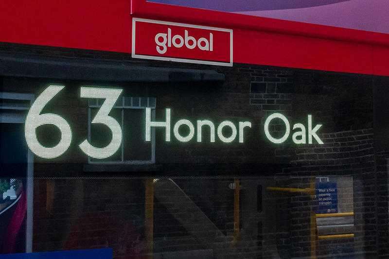
Electric buses on route 63

In the first months of 2022, electric buses were rolled out on route 63 (see ianVisits and others).

The destinations on these buses are ‘electric’ as well. They are very bright, and they look fantastic, namely because no more condensed versions of the Johnston typeface are used, or so it seems.

Now let’s have a closer look.
Technology
The letters are constructed from white dots, presumably LED:
Looking at them closely shows that the LEDs have the ability to vary in brightness. If you follow the outline of the letter o all around, it becomes quite clear:
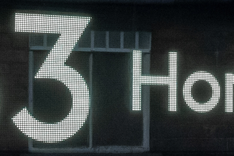
The technology used here is very similar to the one discussed briefly in another post (see here). It is a technology that is, in my opinion, a big step further than the one used in dot matrix displays.
Typeface used
In 2016 the Johnston100 typeface was released. Therefore it could be assumed that what we see on the electric buses would be the Johnston100 typeface. Even more so because the Bus graphic standard says that it’s mandatory. It seems, however, that such an assumption would be wrong. What we see is not Johnston100, and it is not New Johnston either, but it is probably a digitisation of a very early version of Johnston. Maybe someone just digitised old Johnston letterforms found on old destination blinds.
Maybe these two comparisons are helpful:
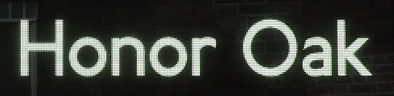
Bus destination and Johnston100 compared. This comparison makes it quite clear that the typeface on the bus destination is not Johnston100. There just are too many differences. For a start the x-heights don’t match (Johnston100 has a much larger x-height and, as a consequence, needs more space). Then some letterforms like H a k don’t match at all. And the letters n r look different as well – in Johnston100 the curved bit comes out of the stem in a completely different manner.

Bus destination compared to the original Johnston letterforms (as shown in Justin Howes’ book Johnston’s Underground type). They’re very close. Therefore the LED letters really are a digitisation of some version of the original Johnston letterforms.
So there we are. The bus is new, the display is new, but the typeface used is not. It isn’t Johnston100, and it isn’t New Johnston either. The design is much older. I’m not saying there’s anything wrong with that. It’s just interesting to find out, that’s all.
Side note on the New Routemaster (roughly a decade ago)
There’s kind of a tradition not to use the newest typeface available. When the New Routemaster buses were rolled out about a decade ago, the typeface that had to be used would have been New Johnston. But again a much older version of Johnston was used. I won’t go into detail. Here’s just a picture of a 453 bus with destination blinds that show old letterforms:

[023] (June 2023 version)
Kommentar schreiben