
This post may soon be a bit retro. Technology is evolving rapidly. In a few years’ time there may be no real ‘writing with dots’ on train indicators and similar displays any more. They may all get replaced by displays that work very much like a computer monitor or like a display of a mobile device. That kind of display can be seen in many Elizabeth line stations:

This post is not about such modern displays, but about older, dot-based displays.
Dots without matrix
The first example is part of a ‘Emergency – Do not enter’ sign. These signs can be found just outside many Underground stations.

This is a display that uses large, discernible dots that are arranged freely, without a grid or matrix. Therefore this is, of course, no dot matrix sign. The text can’t move or change; the whole thing is either off or on.
What I find interesting here is that quite some effort was made to really design letters. The letterforms might well be part of a typeface that would be
- bold
- geometric
- decorative
- and proportional (not fixed-width).
Some letters look absolutely fine. Others – like n and r – show that there are limits as to what can be done using this technique.
Coarse dot matrix
The next example is one type of the next train indicators that can be seen on the platforms of the London Underground.
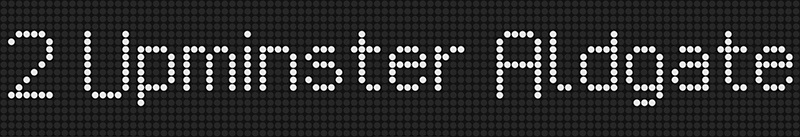
This is a display that uses large, discernible dots arranged in a grid; these displays are often called dot matrix displays. The text can move and change.
A display like this one can be called a dot matrix display for the following reasons:
- The dots are arranged in a grid or matrix.
- The dots are rather large. From a typical viewing distance they can be seen and kept apart with the naked eye.
- The dots are dots, not squares or rectangles. Dots don’t touch when arranged in a line. You can still see that they are dots. (Whereas in raster / bitmap / pixel letterforms, the smallest elements usually have straight sides and touch; so that in straight lines there are no seams, making it impossible to keep the elements apart from a normal viewing distance.)
- The letterforms are not rasterised for display. They are not stored as higher-quality vector shapes that are, when being displayed, laid over the grid. Instead the letterforms are stored as character patterns. Each character pattern predefines exactly which dots light up to display a certain letterform, and there’s no adapting done on the fly, and also no scaling.
A coarse grid allows for the construction of recognisable letter shapes, but there’s not much room for design. In fact, one is tempted to say that the text shown above is as close to ‘plain text’ as one can get.
To be exact we have to bear in mind that from a viewer’s perspective there is no such thing as plain text (external link). Text just cannot be completely plain. When we look at letterforms, there’s no way around their having some kind of shape, and the shape can’t ever be completely irrelevant. This even applies to letterforms that are considered to be very unrefined.
It’s interesting to compare different dot matrix signs because they show different ways to deal with the compromises that have to be made. Some letterforms look better than others. And depending on the number of dots available, certain parts of the letterforms, like ascenders and descenders, are treated in different ways. In the last example below neither the baseline nor the x-line (about in the middle of the letterform) are fixed!


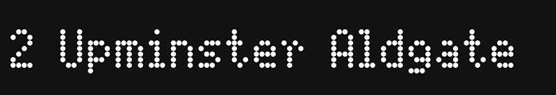
Displays like these have been with us for some 40 years. When they go they will be missed. Here’s an example from Edgware Road (Bakerloo line) station:

Fine dot matrix
The next example is a display used on London Underground S Stock trains. Some examples:

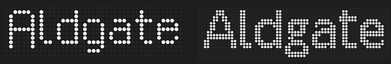
Just like in the previous example the letterforms are constructed from dots arranged in a grid. But this grid is finer, which allows for more ‘design’ when constructing the letterforms. In this case the letterforms resemble the Johnston Underground typeface. One could say that this is in effect the Johnston Underground typeface, constructed dot by dot for this specific output device (which still is a dot matrix display).
Here’s a comparison between one of the coarse dot matrix examples from further up and the finer ‘Johnston’ dot matrix:
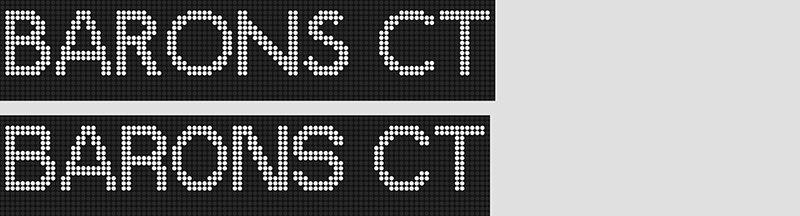
And here’s a comparison between the ‘Johnston type’ dot matrix letterforms used for S Stock trains and other letterforms that can be seen e.g. on 1973 and on 1995 Stock trains. If you want to take a close look you’ll find that some letterforms are very similar or even identical (e.g. the letters T), but other letterforms differ a great deal (e.g. the letters S).
Higher resolution displays
The next example is a newer kind of display; it can be seen outside Oxford Circus station (picture taken in 2017):

This display has a higher resolution. From a typical viewing distance the LED dots can’t be kept apart. The letterforms are those of a Johnston typeface, but I assume that in this case the letterforms were not pre-constructed dot by dot, but they are rasterised while being displayed.
This is not a dot matrix display any more.
Moreover it appears that the dots can take on different colours and varying levels of brightness:

close-up

close-up, colours removed and levels adjusted
Typographical mimicry
There are many typefaces out there that were designed to look like they belong to one of the categories shown further up.
And yes, design-wise they may belong to one of those categories. But technically they are usually quite different: The dots you see in an old dot-based display are the smallest elements of the display that light up. The dots you see in the typefaces below are not the smallest elements; each dot is a vector shape that is laid over a grid of even smaller elements (pixels), so that each dot is actually made from a bunch of pixels. Therefore if you buy a dot matrix font you buy a vector-based font that uses sophisticated technical means to mimic an earlier, quite different technology. There’s absolutely no necessity to do that, but it’s done all the same, sometimes in a playful manner.

Selavy, designed by Nina Stössinger, is similar to the first example shown above.
FF Dot Matrix, designed by Stephan Müller and Cornel Windlin, is similar to the second group of examples shown above. Each dot is produced by a vector shape (below).

[013]
Kommentar schreiben
Alfie L (Samstag, 18 Juni 2022 21:51)
London Waterloo
Jason (Sonntag, 21 April 2024 05:20)
Jason